-
Classification and Colors
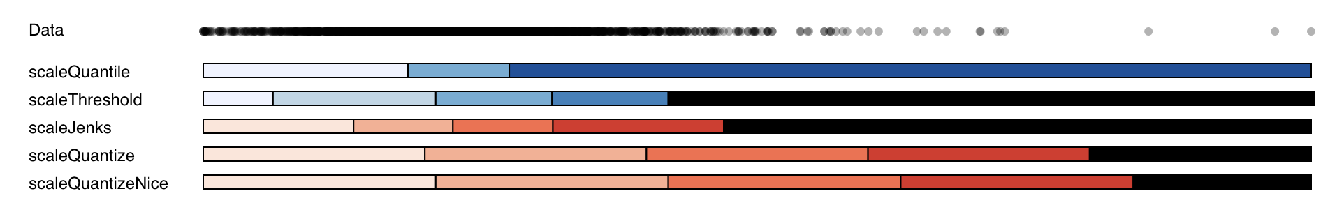
Assignment two is called Colors and Classification and used different classification models and colours to show the percentage of seniors in Georgia. This assignment was a stepping stone for later assignments, where actually created maps.
-
Choropleth Map
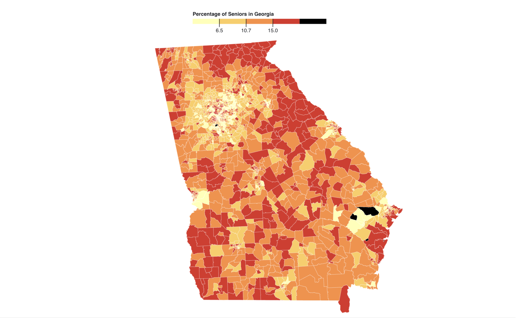
This choropleth map shows the percentage of seniors in Georgia. We can evaluate the spatial patterns. Firstly, Atlanta is not well visible due to the large amount of Census Tracts in that area. We see similar notions for Columbus, Macon, Augusta and Savannah but not as severely. It is evident is that there is no linear trend to data, the percentage of seniors varies quite a lot. What is noticeable, however, is the fact that the suburbs of Atlanta and other larger cities are dominated by a smaller percentage of senior citizens. This could be explained by the workforce and students populating the area. Furthermore, there is an outlier on the Nothern border of Georgia, where the perecntage of seniors is close to 50 percent.
-
Graduated Symbol Map
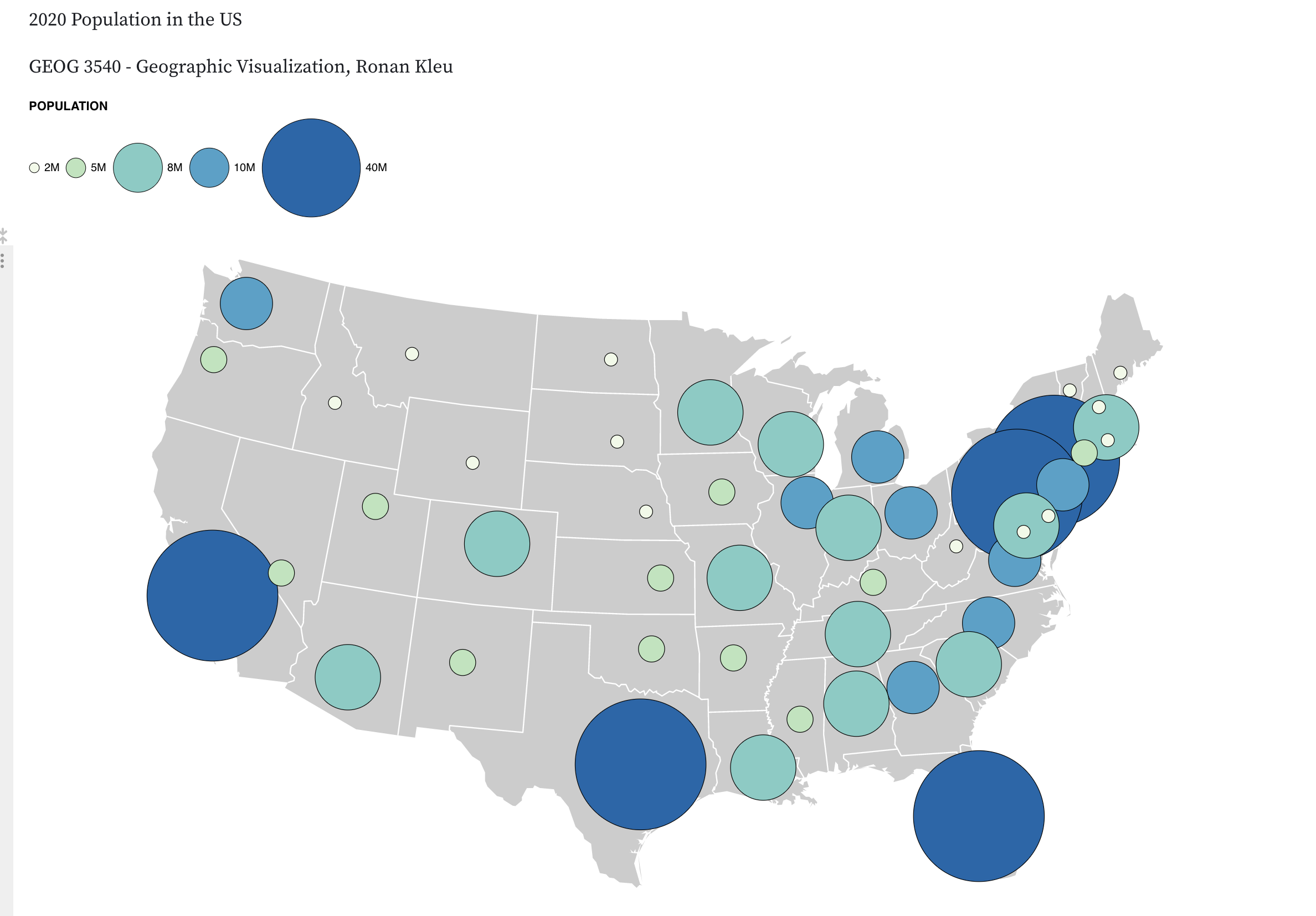
This graduated symbol mapping I created shows the population distribution in 2020. The highest population in 2020 occurs in large states such as California, Florida and Texas. Additionally, there is a population hotpot in the North-East of the United States around Maryland, DC and New York. The Midwest shows the lowest number for population, whereas the East is associated with higher number of inhabitants, most likely due to the topology of the Midwest with the prairies, aridity, and Rockies mountain range.
-
Bivariate Map
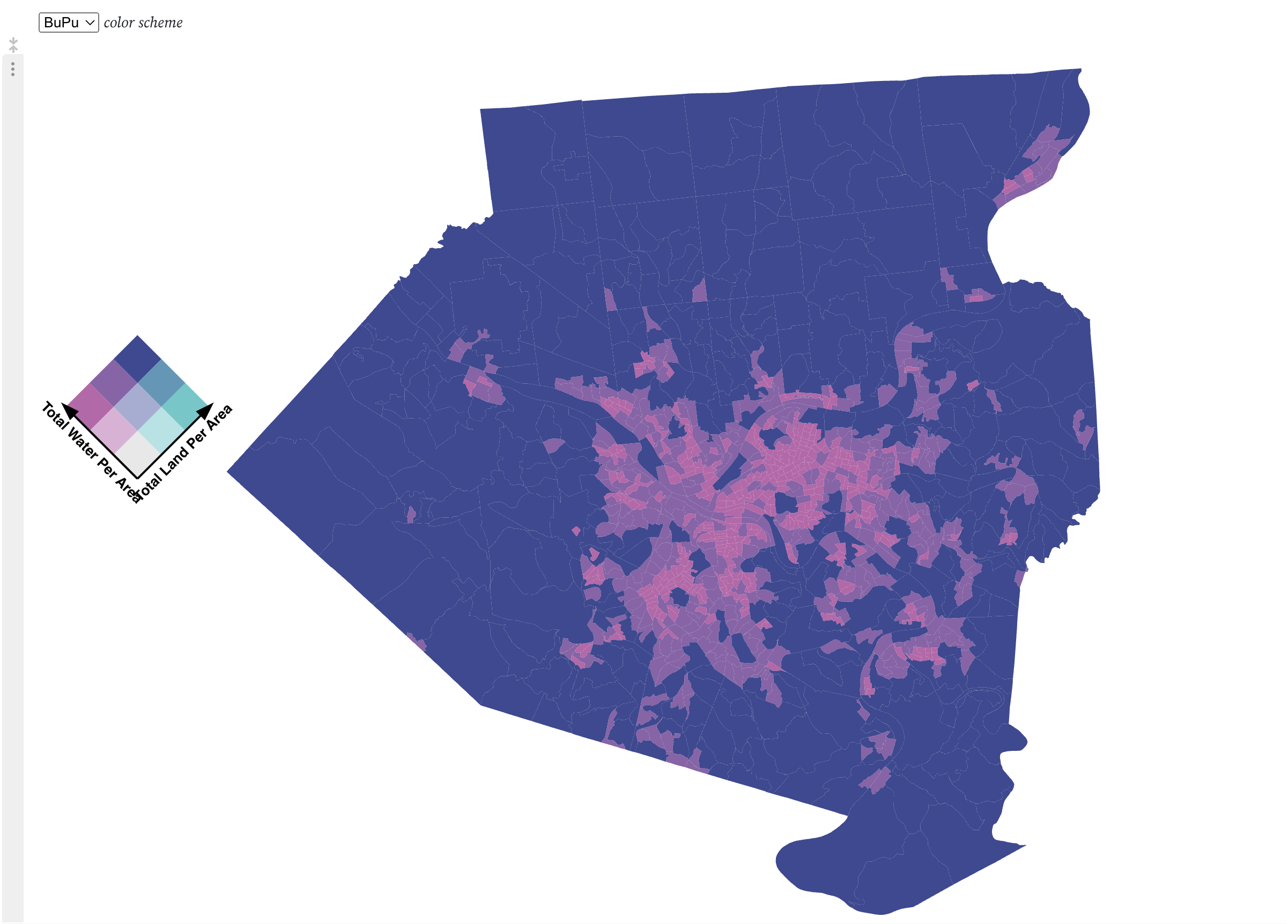
This map shows the land to water ratio in Allegheny county, PA. Spatial patterns: This map of Allegheny County which encloses Pittsburgh shows the distribution of the total amount of water and the total amount of land per area. The darkest shade shows a large amount of both, whereas lighter shades represent a predominance of either land or water. Using the purple orange as an example, the brown denotes a high ratio of both land and water, the yellowish more land, the purple more water and the whitish little of both, which won't be the case often. It's interesting to see that there is no tract where water isn't very prevalent. Upon closer inspection on Google Maps, this makes sense as there are a multitude of creeks that run through those tracts. The areas which are dominated by water around Pittsburgh are due to the convergence of the Ohio, Allegheny and Monongahela Rivers. Please note that this represents a ratio rather than the absolute area.
-
Isarithmic map
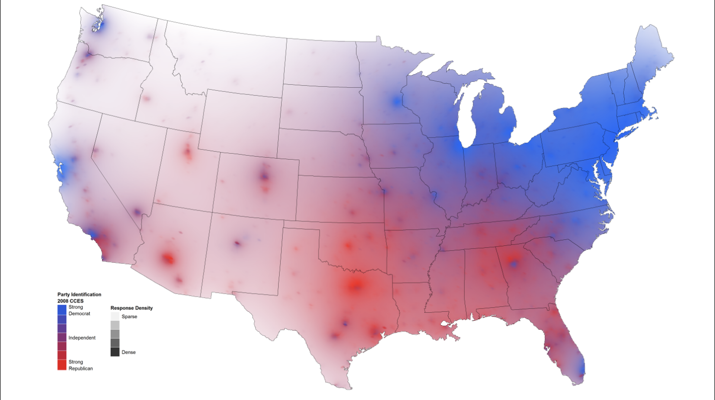
This isarithmic map is one that I found online created by David Sparks. I thought this map was interesting as it shows party affiliation among voters in the United States but on a continuous scale in an isarithmic map.
-
Flow map
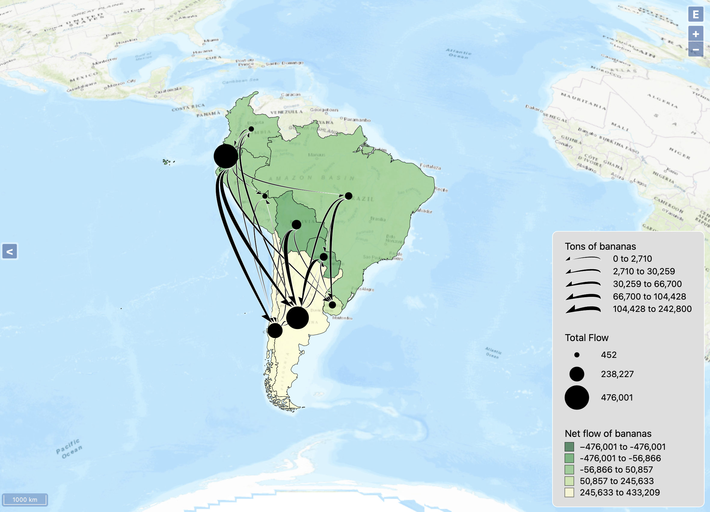
This flow map was created to showcase North-South climate differences in South America and its impact on the flow of bananas.
The intent behind this flow map was motivated by a key element in the interpretation of the data, namely the North-South climate differences.
Therefore, I chose a basemap that had the title “Amazon basin” and “Patagonia” visible. Next, I used a flipped green-yellow colour scheme for the fill where green represents a large export of bananas and yellow a large import. This fits the climate with the equitoral regions being highly tropical and the Southern parts being a lot more arid. Next, the choice of black colour for the lines gives the map elegance and provides a good contrast to the lighter background colours. Finally, I used natural breaks for the majority of the data as it suits this type of data best. This is because it seeks to minimize the variance within each class while maximizing the variance between classes, resulting in classes that reflect natural groupings in the data distribution. I kept the flow number at 18, which is the lowest number still showing all flows. There was not too much visual cluttering, and the dominance of North-South flows was still visible without information loss.
As mentioned above, I strongly based the design of my flow map on the
message it’s portraying. We can see a stark difference between the Northern parts and the Southern parts of South America. Despite its relative size, Ecuador remains the hub for banana exportation as it exports to the Southern countries. There is a large resultant inflow of bananas in Argentina, Uruguay and Chile. The North-South flow can be explained by the climate South America experiences. The equator runs right through Ecuador and the Northern parts of Brazil, providing those areas with ideal temperature and precipitation to grow bananas. Brazil doesn’t prosper quite as much from the favourable conditions due to the extent and density of the Amazon rainforest. Chile, Argentina and even Patagonia in Argentina on the other hand experience much more arid, less stable and colder climate than their Northern counterparts.
-
Small multiples
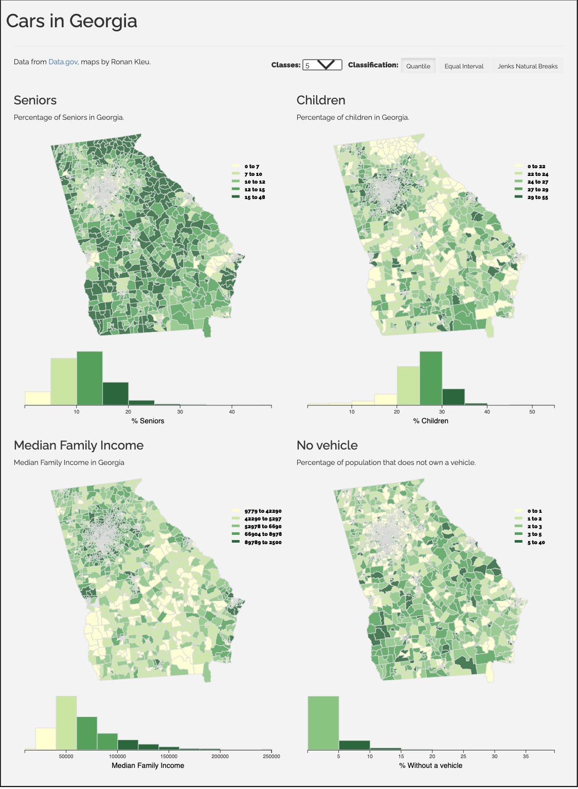
This small multiples map shows the number of cars in Georgia and allows me to show the correlation to other variables simultaneously. I chose the percentage of seniors, the percentage and children and median household income. Naturally, where the percentage of children and seniors is higher, we may expect a lower number of vehicles in a such region. Parallelly, the lower the family median income, we can hypothesize the lower the number vehicles per family would be in the region.
-
Final project
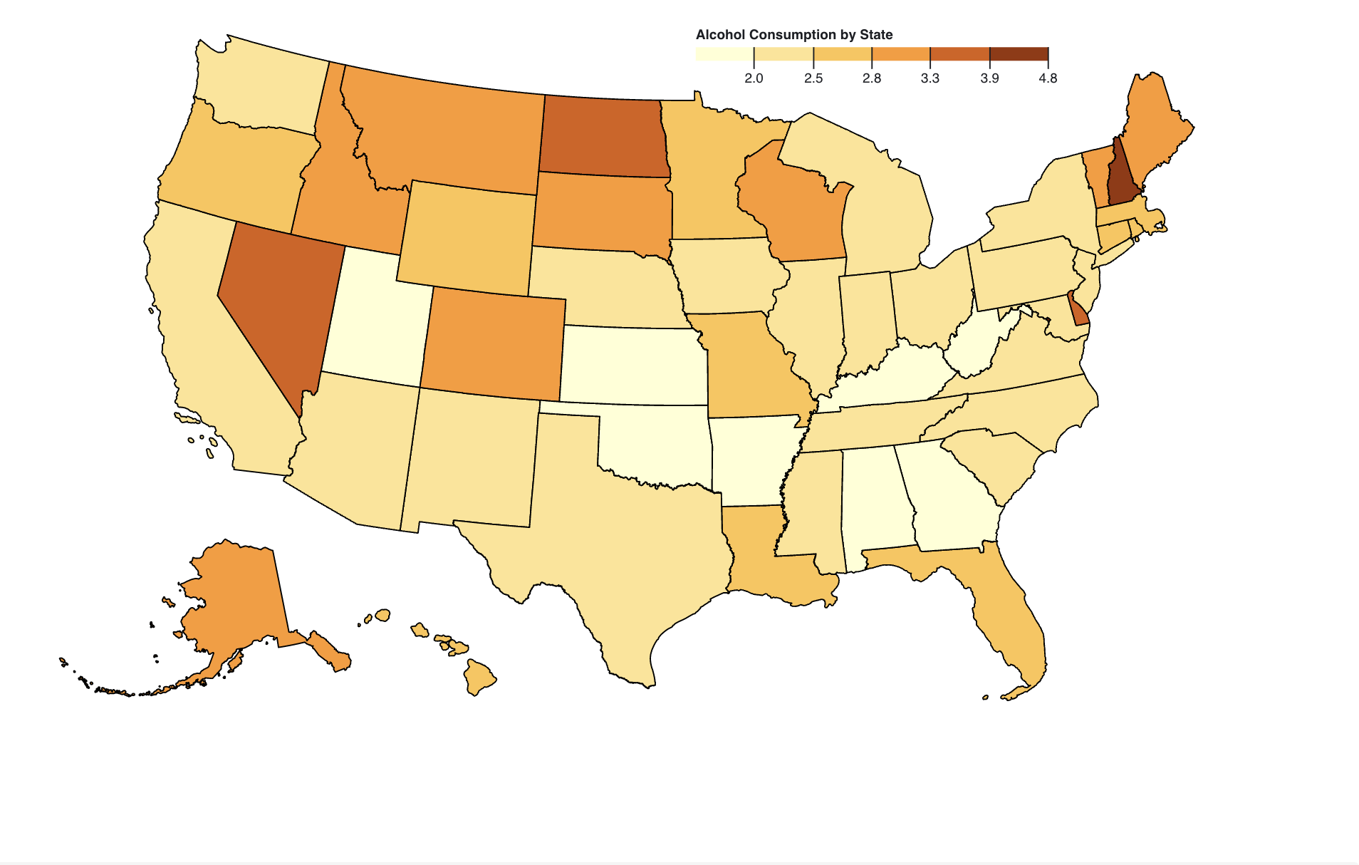
This final project is created by Mattison Belardo, Isaac McSorley and Ronan Kleu. The overarching goal of this project is to analyze alcohol consumption trends for each state in the US between the years 1977-2016. We want to gain an understanding of the drinking practices of each state, as well as overall consumption trends. We will use a combination of maps, statistical displays, and interactive visualizations to effectively communicate our data. We will use maps to display total alcohol consumption per state, total beer consumption per state, total wine consumption per state, and total other alcoholic beverage consumption per state, over the 10-year period. Statistical displays will be used to compare the different types of alcoholic beverages, as well as their total consumption rates over time. Finally, interactive visualizations will be used to allow the user to explore the data and find meaningful patterns. From there we plan to answer the following questions: What are the drinking practices of each state from 2006-2016? Have any of the states seen a major increase or decrease in rates over time? Overall, what is the most and least popular type of drinks in the United States? Does one specific type of alcoholic beverage play a larger role in total alcohol consumption than others? Our target audience is researchers, policy makers, and the general public who are interested in understanding the drinking practices of each state and how they have changed over the past 10 years.
Contact